UX/UI design, in layman’s terms, is all about creating an engaging and intuitive user experience (UX) and user interface (UI). But here’s the twist: it’s about understanding how users think, feel, and behave when interacting with digital products. This is where psychology comes into play.
We’ve all tried to navigate a poorly designed website or app that leaves us feeling frustrated and confused. It’s because the design doesn’t align with our cognitive processes. When we encounter something unfamiliar or complex, our brain goes into overdrive trying to figure it out.
We avoid these pitfalls by designing with psychology in mind. This means understanding cognitive load theory (the amount of mental effort required to process information), visual perception principles (how we see and interpret visual information), and emotional responses (how we feel when using a product).
For instance, consider Amazon’s one-click buying feature. From a psychological perspective, it reduces cognitive load by simplifying the decision-making process — one click, and your purchase is on its way! The result? A seamless user experience that keeps customers coming back for more.
Good UX/UI design isn’t just about aesthetics; it’s about creating an intuitive and enjoyable user experience that aligns with our psychological processes. This is how UX/UI design plays an important part in conversion rate, dropoff rate, user satisfaction, and user retention rate.
Theories of Perception in UX/UI Design
Perception is the phenomenon that enables us to make sense of the world around us. And guess what? It plays a pivotal role in UX/UI design too! In the realm of UX/UI design, we’re concerned not just with how things look but also how they are perceived and interpreted by users. This is where theories of perception come into play.
The Gestalt Psychology theory suggests that humans perceive visual elements in groups or as a unified whole rather than as individual components. We instinctively search for patterns and order in complex visual stimuli to make sense of them. Ever noticed how your Instagram feed is organized into a grid format? That’s Gestalt psychology at work! The grid layout groups related content together, making it easier to process and navigate.
When we design, we don’t just throw elements randomly onto a screen; we carefully arrange them to facilitate pattern recognition and ease cognitive load. By understanding and applying these perception theories, we can create more intuitive and user-friendly designs.
Cognitive Load: Its Effects on UI Design
In the world of UX/UI design, we’re wrestling with cognitive load. This refers to the total amount of mental effort being used in working memory (think of it as your brain’s RAM). Too much information or overly complex tasks can overload this system, leading to errors and frustration.
In UI design, we aim to minimize this cognitive load to ensure a smooth and enjoyable user experience. It’s like hosting a dinner party — you wouldn’t want to overwhelm your guests with too many dishes at once. Instead, you’d serve them in courses, allowing them time to savor each dish.
The same applies in UI design. We aim for simplicity and clarity over complexity and ambiguity. Take Google’s homepage for example: its clean, minimalist design puts users at ease by reducing cognitive load. There aren’t multiple menus or excessive text vying for attention. This allows users to focus on their task without unnecessary distractions.
Managing cognitive load is all about understanding human limitations and designing accordingly. By doing so, we can create interfaces that are not only visually appealing but also cognitively considerate.
Are you interested in leveling up your user experience through UX/UI design? Learn more about our UX/UI Design Services.
Emotional Response & UX Design
As UX/UI designers, we don’t just design for functionality; we also design for emotion. Our aim is to evoke positive emotional responses from users through our designs.
We achieve this with a blend of psychology and artistry. We strive to understand what makes users tick — their desires, frustrations, and habits — and then translate these insights into design elements that resonate with them on an emotional level.
One technique is color psychology. Different colors can elicit different emotions in people. Blue often conveys trust and reliability (think Facebook or LinkedIn), while green tends to be associated with growth and tranquility. We can subtly influence how users feel when interacting with our interfaces.
We have to ensure that each step in the process is intuitive and satisfying — from the moment they land on the homepage to when they complete their intended task (be it making a purchase or finding information).
Good UX design isn’t just about reducing cognitive load; it’s also about creating an emotionally engaging experience. This can foster brand loyalty and turn casual users into raving fans.
The Role of Memory in User Interaction
Memory plays a pivotal role in shaping user interactions. Humans are creatures of habit. We’re wired to remember and repeat past actions that have yielded positive results.
When we interact with an interface, we rely on our cognitive map to guide us through the process. This means that consistent design patterns and recognizable elements can significantly streamline user interaction.
However, while familiarity breeds comfort, it also breeds expectation. If an element looks like something users have interacted with before but functions differently, it can lead to confusion and frustration. So while we want to leverage users’ memories to enhance usability, we also need to ensure consistency in functionality across our designs.
By understanding how memory works and applying this knowledge in our designs, we can create interfaces that feel intuitive and familiar, making the user experience not just functional but also delightful.
Understanding User Behavior Through Heuristics
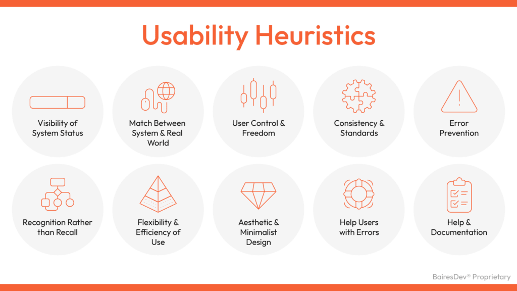
Heuristics, or mental shortcuts, are the unsung heroes of UX/UI design. They allow us to predict and anticipate user behavior, making our designs more intuitive and user-friendly. But understanding these cognitive shortcuts is not as simple as memorizing a list of do’s and don’ts.
Consider the “recognition over recall” heuristic. It posits that users are better at recognizing information they’ve previously encountered than recalling it from memory. This principle explains why drop-down menus are generally more effective than open-ended input fields.
We must balance this heuristic with others, like “less is more.” Overloading a drop-down menu with too many options can lead to choice paralysis. Heuristics guide us in crafting experiences that align with how users naturally think and behave. We can create interfaces that feel instinctive and effortless to navigate.
The Impact of Attention on User Experience
Let’s consider a simple yet effective example about attention: push notifications. These little pop-ups are designed to grab our attention amid a sea of digital distractions. They work on the principle of selective attention, which allows users to focus on specific elements while ignoring others. Overuse or misuse of these notifications can lead to attention fatigue, causing users to disengage or even abandon the platform altogether.
We must remember that guiding user attention is not just about making things noticeable. It’s about creating an environment where relevant information stands out without overwhelming or annoying users.
User Motivation & Reward Systems in UX/UI Design
In UX/UI design, we’re tasked with understanding what makes users tick and then leveraging that knowledge to create engaging, satisfying experiences. When it comes to driving user engagement, few tools are as potent as motivation and reward systems.
These systems tap into our innate desire for achievement and recognition. They incentivize users to engage with a platform by offering rewards — tangible or intangible — for completing certain actions or reaching specific milestones.
Consider the example of fitness apps. These digital coaches often employ gamification techniques to motivate users toward healthier lifestyles. Users might earn badges for hitting their daily step goals or receive motivational messages after logging workouts consistently. This is more than just fun and games; it’s about creating positive feedback loops that encourage continued use and engagement.
It’s important to note that while reward systems can be powerful motivators, they need to be thoughtfully designed. Overly complex systems can confuse users, while too simplistic ones may fail to engage them effectively. It’s all about striking the right balance — a dance between challenge and reward that keeps users coming back for more.
In essence, motivation and reward systems are vital cogs in the UX/UI design machinery. When done right, they can transform passive visitors into active participants, turning an ordinary user experience into an extraordinary one.
Developing User-Centric Experiences in the Restaurant Industry
We closely collaborated with a client from the restaurant industry to synchronize the charm of their in-location ambiance with a highly advanced e-commerce platform. Our software development team committed itself to crafting a new website. Our design strategy revolved around creating a seamless, user-centric interface that guides customers through their ordering process. This streamlined and intuitive shopping experience ensures customers can place orders and track their journey from purchase to delivery.
The end result is a platform where customers feel just as valued and indulged as they would in person, offering a true reflection of the brand’s essence.
Five Additional Principles
Let’s delve into these five cognitive psychology theories:
- Retention theory: Users spend a limited time on a homepage, suggesting that concise design aids faster progression.
- Serial-position effect: Users remember the first and last elements more than those in between.
- Hick’s Law: Too many choices lead to delayed response time, so avoid overwhelming users.
- The Schema theory: Organizing information into meaningful units is appealing.
- The chameleon effect: Mirroring user emotions aids connection and understanding.
In Conclusion
UX design and psychology share a common goal: understanding human cognition patterns, decision-making processes, and consumer needs. By incorporating these cognitive psychology theories into our work as UX designers, we can avoid certain design pitfalls while discovering solutions that enhance user experience.


